Predicting Quality Starts
Introduction
In developing a strategy for drafting pitchers, I had Fangraphs projections for all of the relevant scoring categories except quality starts. I searched high and wide for this through all of the projection systems on Fangraphs, and then I came across this comment, which made me realize I wasn’t the only one who wanted it.
Clearly, if I figured out how to predict quality starts, I’d be addressing a gap for me and other fantasy baseball owners, and I’d be able to apply my z-score method (addressed here) to pitching data as well. Quality starts is continuous, so linear regression seemed like an appropriate approach.
Getting the Data
I already wrote a post about scraping data from Fangraphs and Baseball Reference. I saved all of the data as .csv files by year. I did a bit of data cleaning which I’m not going to spend a lot of time on, but if you’re curious, you can find my code here. A few highlights of data cleaning: I discovered that there are some jokers at Fangraphs who decided to enter projections for “Rob W00t3n”, rather than “Rob Wooten”, sometimes, a space isn’t just a space, but a “\xa0” character, and there’s a lot of non-unique names in baseball.
Tonight I watched Will Smith, catcher, make the final out on a dropped third strike thrown by Will Smith, pitcher, while my husband hummed the theme to the Wild Wild West, sung by Will Smith, rapper.
— Angeline (@dataangeline) September 7, 2019
Fortunately, limiting this analysis to pitchers only meant that didn’t cause as much trouble as I feared.
Let’s start by loading in the cleaned datasets, which are a combination of Fangraphs projection data and Baseball Reference season data.
import pandas as pd
import numpy as np
import matplotlib.pyplot as plt
import seaborn as sns
from sklearn.linear_model import LinearRegression
from sklearn.preprocessing import PolynomialFeatures
from sklearn.linear_model import LassoCV
import numpy as np
df = pd.read_csv('../data/post6/training_data_model.csv')
df_subset = df[['QS_2016', 'FIP_proj_2017', 'QS_2017']].dropna()I’ve broken up my training, validation, and test data by year, reflected in the table below. If you are unfamiliar with predictive modeling, breaking up my data into training/validation/test gives me a few fresh datasets to test my model on, to see if it actually does well on new, unseen data, or if it’s only good at explaining data it’s already seen. I only kept players that showed up in both the Fangraphs projection data, the Baseball Reference season data, and had values for “Quality Start” in the following season. This means that of the 4000 players I scraped data for, each of these datasets has a sample size of just above 200 players. I lost a lot of data, which (spoiler alert) impacted my prediction model. We’ll get into that later.
| Training Data (n=214) | Validation Data (n=208) | Test Data (n=231) | |
|---|---|---|---|
| Features | 2016 Season Data 2017 Projection Data |
2017 Season Data 2018 Projection Data |
2018 Season Data 2019 Projection Data |
| Target | 2017 Quality Starts | 2018 Quality Starts | 2019 Quality Starts |
Exploratory Data Analysis
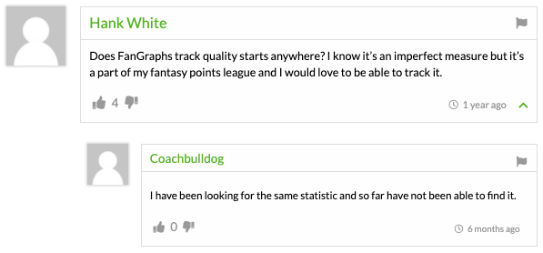
I did some exploratory data analysis by plotting a histogram to better understand how quality starts (also called my ‘target’) are distributed.
sns.distplot(df['QS_2017'], bins = 23, kde = False ,color = "#002D72")
plt.title('Distribution of Quality Starts in 2017')
plt.xlabel('Total Quality Starts in 2017')
plt.ylabel('Number of Pitchers')
plt.show();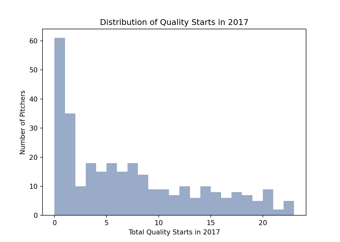
It’s clear that there are a lot of pitchers with a total of zero quality starts. Among those who have at least one quality start, there’s a large range. The distribution is right skewed, which means that there are a few pitchers earning a lot more quality starts than the rest (20+).
I also did some preliminary modeling on some variables (also called ‘features’) I expected to have an impact on quality starts, as a data quality check. I expected that one year’s quality starts would have an effect on the next year’s quality starts, so I plotted those.
plt.scatter(df_subset['QS_2016'], df_subset['QS_2017'])
plt.xlabel("QS_2016")
plt.ylabel("QS_2017")
plt.title("Relationship between Quality Starts in 2016 and Quality Starts in 2017", y = 1.08)
plt.show()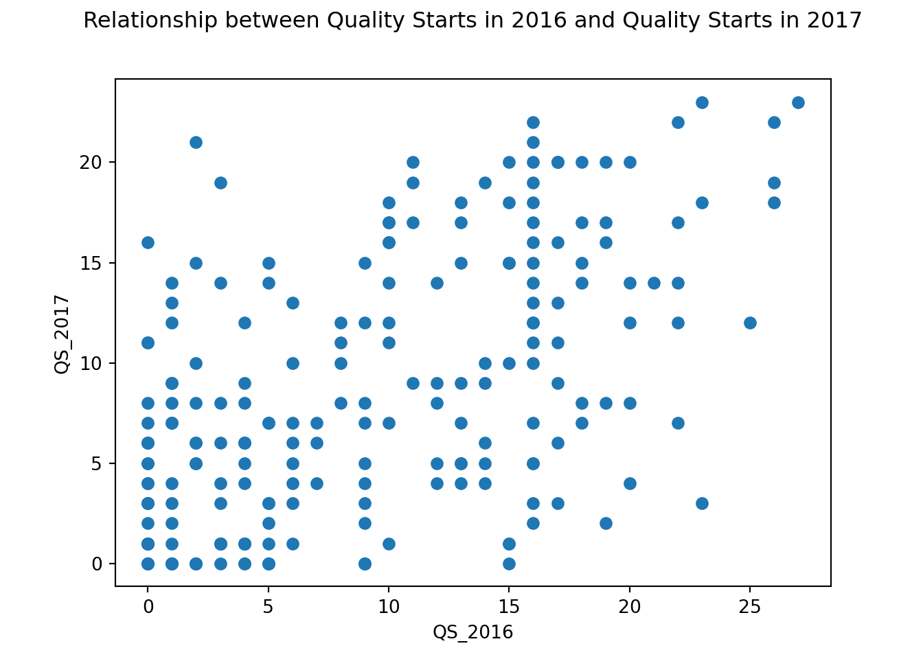 This graph displays quality starts in 2016 and 2017. The distribution doesn’t show a clear positive slope, but there is some positive association. This means that for some pitchers, one year’s quality starts is linked to the next. This isn’t true for all pitchers though, making the association a weak one.
I also looked at Fielding Independent Pitching (FIP), which is a measure of a pitcher’s effectiveness regardless the team defense behind him. This statistic focuses only the events a pitcher can control, like strikeouts, walks, and homeruns. I expected that pitchers with a lower FIP (indicating more effectiveness) would have more quality starts.
plt.scatter(df_subset['FIP_proj_2017'], df_subset['QS_2017'])
plt.xlabel("FIP_proj_2017")
plt.ylabel("QS_2017")
plt.title("Relationship between Projected \nFielding Independent Pitching \nand Quality Starts in 2017", y = 1.08)
plt.tight_layout()
plt.show()
The negative slope for this plot verifies my expectation - the higher the FIP, the lower the quality starts. Based on these plots, I think I have an understanding of how features (like previous year’s quality starts and projected FIP) are connected to my target (quality starts). I did a little more exploratory plotting, because it’s always good to get a good handle on your data, but in the interest of keeping this post shorter, let’s jump to modeling.
Modeling
Training Data
I started modeling by looking at all the features in the training data and selecting a few that I’d expect to have an impact on quality starts. The features selected were based on correlation with the target, and studying pairplots. My initial list included innings pitched, games started, team wins in games started, game score, and a few others. You can compare the list below to the glossary at Baseball Reference, and Fangraphs to understand the full list of the features I selected. Then, I dropped any rows with missing values, since my prediction model won’t like that.
varlist3 = ['QS_2017', 'IP_2016', 'GS_2016', 'Wgs_2016', 'Wtm_2016',  'QS_2016', 'GmScA_2016', 'Best_2016', 'lDR_2016', 'IP/GS_2016', 'Pit/GS_2016', '100-119_2016', 'Max_2016', 'IP_proj_2017', 'K_proj_2017', 'ERA_proj_2017', 'FIP_proj_2017', 'zWAR_proj_2017']
df_nona = df.loc[:,varlist3].dropna()
df_nona.shape
## (214, 18)After dropping all rows with any missing, my training data with these features has 214 rows. I’ll break up my training data into my features (x_train) and target (y_train), and now I’m ready to start modeling.
x_train = df_nona.iloc[:, 1:]
y_train = df_nona.iloc[:, :1]
I did all of my modeling with the python library scikit-learn. I started with a simple Linear Regression to establish a baseline.
m1 = LinearRegression()
m1.fit(x_train,y_train)
## LinearRegression(copy_X=True, fit_intercept=True, n_jobs=None, normalize=False)m1.score(x_train,y_train)## 0.4449424352353504The R^2 score is a measure of how well my model explains the variation in the target. The higher the R^2, the better, and it can go as high as 1. This R^2 of 0.44 doesn’t inspire a ton of confidence in my model.

Sometimes, a model fit can be improved by using polynomial features, if the relationship is polynomial (for instance, if one year’s quality starts meant having ^2 as many quality starts the next year). Given my exploratory analysis, it didn’t look like there were any polynomial relationships (and it is pretty silly to think that having 10 quality starts in one year would lead to 100 the next), but maybe it will help!
mp1 = LinearRegression()
p = PolynomialFeatures(degree = 2)
x_train_poly = p.fit_transform(x_train)
mp1.fit(x_train_poly, y_train)
## LinearRegression(copy_X=True, fit_intercept=True, n_jobs=None, normalize=False)mp1.score(x_train_poly, y_train)## 0.8080558133200387An R^2 of 0.81 is much better! But it’s… too much better.

I’ve probably overfit my model to the training data. I will run the same model on the validation data to see how it performs. If I get an R^2 of around 0.80 on the validation data, then the model does a good job! If it gets something closer to 0.40, then I’d be better off removing the polynomial features.
Validation Set
validation = pd.read_csv('../data/post6/validation_data_model.csv')
varlist_val = ['QS_2018', 'IP_2017', 'GS_2017', 'Wgs_2017', 'Wtm_2017',  'QS_2017', 'GmScA_2017', 'Best_2017', 'lDR_2017', 'IP/GS_2017', 'Pit/GS_2017', '100-119_2017', 'Max_2017', 'IP_2018', 'K_2018', 'ERA_2018', 'FIP_2018', 'zWAR_2018']
validation_simple = validation.loc[:,varlist_val]
validation_simple = validation_simple.dropna()
validation_simple.shape
## (208, 18)x_val = validation_simple.iloc[:,1:]
y_val = validation_simple.loc[:,['QS_2018']]Bringing in the validation set, I’ve selected the same features for the validation data, removed all missings, and broken the data into features and target. There are a total of 208 rows.
I’ll run the model with polynomial features on the validation data first.
x_val_poly = p.transform(x_val)
mp1.score(x_val_poly, y_val)
## -4.891614681424794A negative R^2!

The polynomial features model definitely overfit. My suspicions were confirmed, there isn’t much to suggest any polynomial relationship. Let’s try the simpler model (the first one I ran) on the validation data.
m1.score(x_val,y_val)## 0.3530370475302911This is much closer to the R^2 for the training set, but it’s still not a great R^2.
I am concerned about my small sample size of ~200 players. Perhaps I could improve my R^2 with an increased sample size, by only using either projection data from Fangraphs, or season data from Baseball Reference (especially since I’m not convinced that both are heavily contributing to my model).
Modeling Projection Features Only
I decided to use just the projection features from Fangraphs, since that left more players in the dataset than using the season features from Baseball Reference. The code below subsets the data to include only projection features, removes players with missing data, and breaks up the data into features and target.
proj_varlist = ['QS_2017', 'Age_proj_2017', 'G_proj_2017', 'GS_proj_2017', 'IP_proj_2017', 'K_proj_2017',  'BB_proj_2017', 'HR_proj_2017', 'H_proj_2017', 'ER_proj_2017', 'TBF_proj_2017', 'BABIP_proj_2017', 'ERA_proj_2017', 'FIP_proj_2017', 'K/9_proj_2017', 'BB/9_proj_2017',  'HR/9_proj_2017', 'ERA+_proj_2017']
df_proj = df.loc[:, proj_varlist]
x_train = df_proj.iloc[:, 1:]
y_train = df_proj.iloc[:, :1]
Now I’ll fit a new model based on just the projection features.
m2 = LinearRegression()
m2.fit(x_train,y_train)
## LinearRegression(copy_X=True, fit_intercept=True, n_jobs=None, normalize=False)m2.score(x_train,y_train)## 0.41267303195256966An R^2 of 0.41 is lower than what I got before, but let’s compare the performance to the validation set. I’ll process it as above, and then score the model.
proj_vallist = ['QS_2018', 'Age_2018', 'G_2018', 'GS_2018', 'IP_2018', 'K_2018', 'BB_2018', 'HR_2018', 'H_2018', 'ER_2018', 'TBF_2018', 'BABIP_2018', 'ERA_2018', 'FIP_2018', 'K/9_2018', 'BB/9_2018', 'HR/9_2018', 'ERA+_2018']
val_proj = validation.loc[:, proj_vallist]
x_val = val_proj.iloc[:, 1:]
y_val = val_proj.iloc[:, :1]
m2.score(x_val,y_val)
## 0.36224662605542435This R^2 is slightly better than the model using both projection and season data, and the gap between training and validation is a little closer. I can probably improve the model by removing a few features that aren’t helping to explain quality starts. I’ll use LassoCV to do the feature selection.
In a nutshell, LassoCV “removes” any features that do not contribute to the model, by reducing the model’s coefficients to zero. If this doesn’t make sense to you, all you need to know is:
- There are a lot of features in the current model.
- The model’s R^2 can improve if some of the unimportant features are removed.
- LassoCV can decide which features to remove.
m3 = LassoCV()
m3.fit(x_train, y_train)
## LassoCV(alphas=None, copy_X=True, cv=None, eps=0.001, fit_intercept=True,
## max_iter=1000, n_alphas=100, n_jobs=None, normalize=False,
## positive=False, precompute='auto', random_state=None,
## selection='cyclic', tol=0.0001, verbose=False)
##
## /Users/angeline/.virtualenvs/r-reticulate/lib/python3.7/site-packages/sklearn/linear_model/_coordinate_descent.py:1088: DataConversionWarning: A column-vector y was passed when a 1d array was expected. Please change the shape of y to (n_samples, ), for example using ravel().
## y = column_or_1d(y, warn=True)m3.score(x_train, y_train)## 0.39871058029635065m3.score(x_val, y_val)## 0.393469978694043
It looks like it helped! The training data’s R^2 is 0.40, and the validation data’s R^2 is 0.39. That’s better than before, and the model appears to be performing similarly on both the training and validation, so it’s not overfitting.
Now let’s try the model on the test set.
Scoring the Model on the Test Set
Let’s bring in the test set and process it as we’ve done to the other datasets.
test = pd.read_csv('../data/post6/test_data_model.csv')
proj_testlist = ['QS_2019', 'Age_2019', 'G_2019', 'GS_2019', 'IP_2019', 'SO_2019', 'BB_2019', 'HR_2019', 'H_2019', 'ER_2019', 'TBF_2019', 'BABIP_2019', 'ERA_2019', 'FIP_2019', 'K/9_2019', 'BB/9_2019', 'HR/9_2019', 'ERA+_2019']
test_proj = test.loc[:, proj_testlist]
x_test = test_proj.iloc[:, 1:]
y_test = test_proj.iloc[:, :1]
Let’s see how our model performs on the test data. Fingers crossed for 0.39…
m3.score(x_test, y_test)## 0.3175424713181816Well! That didn’t turn out as planned.

The R^2 took a nosedive! What happened???
Interpreting the Model Results
Quality Starts Through the Years
Given that my training, validation and test data were split by year, it’s possible that there are yearly differences that can’t be captured by the model. I wanted to understand how quality starts may be different across the training (2017), validation (2018), and test (2019) data.
qs_17 = df[['QS_2017']]
qs_18 = validation[['QS_2018']]
qs_19 = test[['QS_2019']]
allqs = pd.concat([qs_17, qs_18, qs_19], axis = 1)
allqs2 = pd.melt(allqs, value_vars = ['QS_2017', 'QS_2018', 'QS_2019'])
years = ['2017', '2018', '2019']
year_colors = ['#002D72','#D50032', '#AE8F6F' ]
color_dict = dict(zip(years, year_colors))
sns.boxplot(x = "variable", y = "value", data = allqs2, showmeans = True, meanprops={"marker":"s","markerfacecolor":'white', "markeredgecolor":"black"}, color = '#D50032')
plt.xlabel('Year of Data')
plt.xticks(range(0,3,1), ("2017", '2018', '2019'))
## ([<matplotlib.axis.XTick object at 0x133e98950>, <matplotlib.axis.XTick object at 0x133e98750>, <matplotlib.axis.XTick object at 0x132f88fd0>], [Text(0, 0, '2017'), Text(0, 0, '2018'), Text(0, 0, '2019')])plt.ylabel('Quality Starts')
plt.title('Distribution of Quality Starts by Year')
plt.show()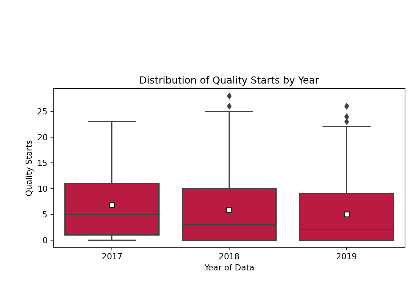
Well, that certainly explains a lot. The mean (white square) and median (horizontal line in the red rectangle) number of quality starts overall has gradually decreased from 2017 to 2019. Naturally, if I’m training my model with data from 2017, it’s going to be bad at predicting something in 2019, since the year of data itself isn’t being captured by my model. Now that I understand that, I’ll look closer at the model results.
coeffs = pd.DataFrame(list(zip(x_test.columns, m3.coef_)))
coeffs.columns = ['feature', 'coefficient']
coeffs = coeffs[coeffs.coefficient != 0]
fig, ax = plt.subplots(figsize = (8, 5))
coeffs.plot(x = 'feature', y = 'coefficient', kind= 'bar', ax = ax, color = 'none', legend = False)
ax.scatter(x = np.arange(coeffs.shape[0]), marker = 's', s = 100, y=coeffs['coefficient'], color = '#002D72')
ax.axhline(y = 0, linestyle = '-', color = '#D50032', linewidth = 2)
_ = ax.set_xticklabels(['Age', 'Games', 'Games \n Started', 'Innings \nPitched', 'Strikeouts', 'Walks', 'Home \n Runs', 'Total \n Batters \n Faced', 'Earned \n Runs \nAverage+'], rotation=30, fontsize=11)
plt.xlabel('Feature')
## Text(0.5, 0, 'Feature')plt.ylabel('Model Coefficient')## Text(0, 0.5, 'Model Coefficient')plt.title('Coefficients by Feature')## Text(0.5, 1.0, 'Coefficients by Feature')plt.tight_layout()
plt.show()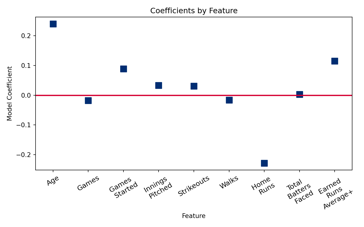
This is a plot of the model coefficients. Coefficients that are furthest away from zero (the red line) have the greatest impact on quality starts. For instance, it looks like each additional year in pitcher age adds 0.2 quality starts. This could be due to better efficiency that comes with more experience. The other coefficients also make sense: home runs are bad for quality starts, so the coefficient is negative, and more games started means more potential for quality starts. A higher ERA plus (the opposite of ERA) goes with better pitching. These coefficients do a reasonable job of describing the relationship between the features and the target.
I also want to explore which players the model had the most trouble with, so I will adjust the dataframe to include the model’s predicted Quality Starts.
test_proj_predict = test.loc[:, ['Full_Name', 'ID', 'QS_2019', 'Age_2019', 'G_2019', 'GS_2019', 'IP_2019', 'SO_2019', 'BB_2019', 'HR_2019', 'H_2019', 'ER_2019', 'TBF_2019', 'BABIP_2019', 'ERA_2019', 'FIP_2019', 'K/9_2019', 'BB/9_2019', 'HR/9_2019', 'ERA+_2019']]
test_proj_predict['predicted_2019_QS'] = m3.predict(x_test)
test_proj_predict['prediction_residuals'] = test_proj_predict['QS_2019']-test_proj_predict['predicted_2019_QS']
I looked at pitchers with the highest residuals (or, difference between prediction and reality), to understand where the model failed. Which players was I totally wrong about in 2019?
test_proj_predict[test_proj_predict.prediction_residuals > 10][['Full_Name', 'Age_2019', 'QS_2019', 'predicted_2019_QS', 'prediction_residuals']].sort_values('prediction_residuals', ascending = False).set_index('Full_Name').head()## Age_2019 QS_2019 predicted_2019_QS prediction_residuals
## Full_Name
## Hyun-Jin Ryu 32 22 7.085192 14.914808
## Lucas Giolito 24 17 5.306966 11.693034
## Marco Gonzales 27 19 7.804383 11.195617
## Shane Bieber 24 24 13.043954 10.956046
## Madison Bumgarner 29 20 9.045565 10.954435The model underpredicted pitchers who were injured the previous year, and then bounced back (like Ryu and Bumgarner), or young pitchers who didn’t have a lot of historical data (Bieber or Gonzales) or underwent a dramatic change in mechanics (Giolito).
test_proj_predict[test_proj_predict.prediction_residuals < -10][['Full_Name', 'Age_2019', 'QS_2019', 'predicted_2019_QS', 'prediction_residuals']].sort_values('prediction_residuals', ascending = False).set_index('Full_Name').head()## Age_2019 QS_2019 predicted_2019_QS prediction_residuals
## Full_Name
## Zack Godley 29 1 11.371187 -10.371187
## Chad Green 28 0 11.856986 -11.856986
## Carlos Carrasco 32 2 16.356610 -14.356610
## Luis Severino 25 0 15.820294 -15.820294
## Corey Kluber 33 2 19.725951 -17.725951The model overpredicted for two pitchers who had lots of injuries in 2019 (Kluber, Severino), and one who was diagnosed with leukemia (Carrasco). These events are tougher to predict, so it’s reasonable that the model failed here.
Wrapping It All Up
As a final analysis, I’ll calculate mean absolute error, which tells me on average, how off my model was.
def MAE(actuals, preds):
    return np.mean(np.abs(actuals-preds))

MAE(test_proj_predict.QS_2019,test_proj_predict.predicted_2019_QS)
## 4.5048492504957505To sum it all up, given the differences in quality starts across years, a time-series analysis may have been better suited to predict quality starts.

The model did identify a few features that are useful for understanding quality starts, namely, age, and home runs. It was a horrible failure at predicting some difficult to predict events like injuries and bounce backs, but overall, it was off by 4-5 quality starts a year. This is close enough for me, since I was working with no projection at all, but this may be too unreliable for others. I will include this in my z-score rankings for the next draft, and we’ll see how it goes! Stay tuned.